Why MISUXIN Changed Its Logo
Many brand logos have become so familiar that simply seeing one tells you what the brand does and what it sells.
A distinctive logo plays a very important role in the development of a brand's culture. A good brand's logo will be refined and evolve with the times. Looking at familiar brands' original logos and how they have changed gives us a sense of the enormous changes in the companies behind them.
In 2008, Huaqiangbei, led by SEG Group, had developed into an electronics market specializing in domestic and international electronic components and production supply-chain support. That same year, the China Electronics Chamber of Commerce awarded Huaqiangbei the title ‘China's No. 1 Electronics Street.’ It continued to develop, eventually becoming a central hub for China's electronics trade. MISUXIN was also incorporated that year.
The company was small and had few employees, but its founder, Zhong Mingxian, still drew a MISUXIN logo himself. Looking back, its colors and lines seem rough and not particularly professional from a design perspective. Yet it held Zhong's vision and determination for the future.
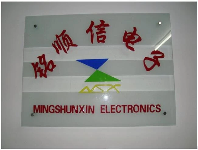
(MISUXIN's first-generation logo)
In that golden era, when timing, location and people came together, a one-meter counter in Huaqiangbei could produce a billionaire. But as large numbers of counterfeit goods and speculative traders entered the market, competition intensified, and component prices even suffered severe declines. Having established a company and created our own logo, MISUXIN had committed to this industry. We would stay true to our original purpose, rather than focus only on immediate gains. What MISUXIN sought was customer trust and lasting brand value.
Markets fluctuate, and the rise of the internet dealt another heavy blow to physical component shops. After 2011, e-commerce gradually grew, and the sales side of Huaqiangbei's electronics supply chain began moving online. Component pricing became almost transparent, leaving many traders with little profit and prompting them to leave. MISUXIN kept pace with the times, launching its own website and establishing sales channels on several electronic-component industry websites.
As customer numbers grew, MISUXIN gradually expanded its business beyond integrated circuit chips. The company moved to new premises and once again upgraded and refined its logo.
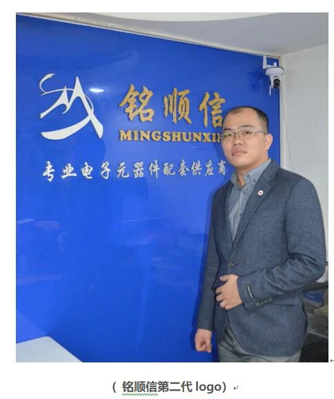
The second-generation logo took the shapes of ‘M,’ ‘S’ and ‘X’ and reinterpreted them as a mountain and a winding mountain road. Building a business is like climbing a mountain: only by advancing one step at a time can you experience the feeling of standing at the summit and seeing all the other mountains below.
Through successive waves of change, MISUXIN found its own path under Zhong Mingxian's leadership. With advantages including authorized representation through original-manufacturer channels, genuine-product assurance, reasonable prices and fast delivery, MISUXIN continually expanded its business and grew more certain of its future direction.
Before entering its next stage of development, as the 5G era arrived and new forms of energy attracted growing interest, MISUXIN changed its logo once more and established a complete visual identity system. The new logo combines the initials ‘MSX’ into the infinity symbol, ‘∞,’ representing strength, permanence and development.
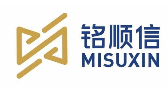
(MISUXIN's third-generation logo)
The evolution of MISUXIN's logo reflects both the company's history and its corporate culture and direction. MISUXIN will continue to keep pace with the times, drawing on its team's 15 years of purchasing experience to embrace the next market trend and the next opportunity.